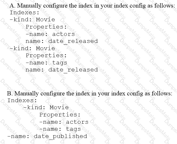
You need to compose visualization for operations teams with the following requirements:
Telemetry must include data from all 50,000 installations for the most recent 6 weeks (sampling once every minute)
The report must not be more than 3 hours delayed from live data.
The actionable report should only show suboptimal links.
Most suboptimal links should be sorted to the top.
Suboptimal links can be grouped and filtered by regional geography.
User response time to load the report must be <5 seconds.
You create a data source to store the last 6 weeks of data, and create visualizations that allow viewers to see multiple date ranges, distinct geographic regions, and unique installation types. You always show the latest data without any changes to your visualizations. You want to avoid creating and updating new visualizations each month. What should you do?


